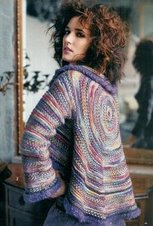
My beginning on 2 circs is working out quite well in some ways, not so great in others. Major problem? The color! Linda you are wise to wait to order your contrasting color. I'm using chocolate, which is one of the colors in the Vera colorway. I'm coming to the conclusion that the contrast needs to be a completely separate color. The twisted stitches just look like more variegation. That's not much bang for your knitting buck. I want to complete a second repeate of the stitch pattern before deciding, though. I'll post the photo then.
The hard part is that every fiber of my being tells me charcoal will look like crap for the contrast. Because what does charcoal have to do with the Vera colorway? Nothing! Maybe one of the colors, but much darker, like a really dark green or brown (if Lorna's makes such animals) would work. I think contrast is in order, but it still has to coordinate, or at least that's what my brain is telling me.
March 30, 2006
Subscribe to:
Post Comments (Atom)


1 comment:
Reb: The colors of the Vera are a soft shade. So I think you are correct the Charcoal would not work with that color scheme. It depends on the look you are looking for but if you use any color within the Vera it will just a part of the Vera. There would be no sharp contrast.
Try copying and pasting the Lorna swatches on a word document to see them side by side. That might help you make a decision.
Ana Maria
Post a Comment